 |
Dawn breaking the cloud cover.
|
Not a brilliant snap by any means and I'll have to be honest I did monkey with the colour here to try and convey the real beauty of this particular sunrise. I'm up early because it's a Sunday during the holiday season and I'm here to do some Mullet fishing and the crowds are not conducive to such activity.
|
 |
Water on Mars? no just low tide at East Head.
|
It can get a little scary with tides at this location and they do have the flags out most of time. You're safe as long know what to look for but complacence can be the undoing of anyone so stay focused. The Weever Fish make waders a necessity if you're spending much time moving through the water and such encumbrances make you particular vulnerable to rising water and quicksands in such circumstances.
|
 |
Isn't the sky pretty?.
|
Yeah I'm like that, I'll snap anything that takes my fancy. This is a different day, I think, I took the opportunity to settle amongst the dunes for a few monuments and soak up a little sun and noticed this.
|
 |
Verrrahhgwoooshhhhhh!
|
Just leaving a bit early, partly because the crowds were turning up but also a local Bass fishing guide had turned up, who's quite well known, and had spotting me catching Mullet. I didn't spot him until he hailed me while I was playing a fish, we exchanged a few words, the usual cordial fare between anglers but his ignorance on Mullet was apparent. Unfortunately he compounded his ignorance by shadowing me and thrashing the water with his fly rod, probably in the hope he could tempt a mullet from my trail of bait. I tried moving but couldn't shake him off and he killed the fishing stone dead, shame really I was having a good day till then. Anyway I was just leaving and I heard this sound like the ground opening up, they were moving really fast and came out of nowhere, I was lucky to catch this snap
|
 |
Interesting tree
|
On this day, I just took some time to explore the area. This is the other side of the inlet to the salt marsh. You can see that the prevailing wind evident in the shape of this tree.
|
 |
The loneliness of the long distance angler.
|
This is an example of that Sussex light I mentioned, I call it silvery in honour of McGonnicall's first Tay Bridge poem.
|
Sunday, 6 October 2013
West Wittering
After my recent post of some snaps I thought I'd dig some more out of one particular location featured in that post. That would be West Wittering, East Head in particular. There's something unusual about the quality of light on the Sussex coast, I think it's because the cloud tends break up over that region, so even on days with no shadow the light can still be quite beautiful.


Saturday, 28 September 2013
A neddy and some explanation
You might recall that quite some time ago I sort of promised I'd post something on linear perspective and you probably also noticed that it hasn't appeared. Honestly I'm not deliberately teasing, I have actually bashed out some words on the subject but after reviewing the first attempts I found them hopelessly anorak orientated and filed those drafts under B. I'm in the middle of my latest attempt which is better -- ish and was hoping to post something soon, only something's come up that need my attention, a prospect of some regular illustration work. Normally I'm pretty dismissive of these prospects, I've seen too many of 'em of evaporate but this one coincides with a focus of my interest, so I'm gonna give it a go. Meanwhile I'd thought I'd stick up a picture up for entertainment value, this is a very old drawing that I used reference gleaned from one of those pony mags for. It's the pencil drawing for and piece of ink work, which I don't have. I had the inked version pinned to the wall of my studio (bedroom) for quite some time, till a colleague took a shine to it, so I gave him the drawing, which he passed on to his daughter.
This drawing has also been submitted to one of those on demand print sites. I was a bit naive about how those sites work and kind of expected to do some business. After a while it became clear that they're not much more than an exercise in vanity publication, so prompted by disillusion I put ridiculous prices on the stuff I submitted. Anyway here it is for free, albeit in a reduced resolution although if you right click on the pop up a higher resolution file should be available as a lossless png.

This drawing has also been submitted to one of those on demand print sites. I was a bit naive about how those sites work and kind of expected to do some business. After a while it became clear that they're not much more than an exercise in vanity publication, so prompted by disillusion I put ridiculous prices on the stuff I submitted. Anyway here it is for free, albeit in a reduced resolution although if you right click on the pop up a higher resolution file should be available as a lossless png.

Wednesday, 11 September 2013
Gone fishing
Hampshire, it's not the most spectacular county in the land but there is at least one prominent geographic feature worthy of note. Watership Down is a finger of land that delineates the elevated chalk laden terrain of Hampshire with the plane of the neighbouring Berkshire. I've often travelled along the adjacent route and it's interesting to note how marked the difference between the terrains appears there, much more abrupt than the gentle transition on the A33 via the ever drab Basingstoke. You often find yourself descending from a pleasant day with a moderate level of sunshine into a gloomy damp one, laden with mist or fog.
Even Hampshire's coast is a meagre asset compared to the many beaches of the neighbouring Sussex and certainly inferior to those of Dorset: Bournemouth, the truly spectacular Sandbanks and the ever densely populated Weymouth. Not that Hampshire is completely bereft of coastal attractions, Lymington has a thriving pleasure boating scene and the beach at Milford is a pleasant echo of the shingle banks further west. Southampton too holds a certain appeal, for me particularly because it's one of my favoured venues for Mullet fishing, I wouldn't be venturing into the estuarine waters to bathe there though. So it was with a certain anticipation that I looked forward to my trip to Dorset's Chesil Beach.
The fishing trip had been arranged a few weeks ago but was postponed in the hope our intended quarry, the Trigger Fish, would turn up. Water temperatures are down this year from their highs of the last few years and there had been conflicting reports concerning the presence of these visitors to our shores, that have been turning up in greater numbers. Chesil is the location of a known shoaling spot associated with the wreck of the Royal Adelaide, close to the steeply shelving banks of the beach. We fished there a couple of years ago but were unable to get the spot on the wreck, even so we had reasonable luck, I managed to pull out a nice specimen after several bites that I failed to connect with and my fishing buddy had a couple of nice fish, including a red mullet but alas, he didn't manage to get a Trigger though. This year we managed to get right on the wreck, something that was apparent when my line came back quite heavily frayed after one of the longer casts, the natural shingle of Chesil is quite easy on line, unlike that deposited on the once Sandy beaches of Sussex, it's well weathered with few edges to cause consistent problems with fraying. We did quite well for the first hour or so, pulling out three Black Bream of a good size, sharing rod watching duties between us while we both attempted to temp Bass in the breakers with a lure rod.
After the initial success, things went quiet as the wind picked up and the sun disappeared behind some cloud, a few nibbles here and there with the bait coming back stripped but that was the end of fish for the rest of the day. Eventually the sun came out again it and on the whole it was a pleasant day. I took a break to get some refreshments from the visitor's centre adjacent to the car park, disturbing a hare as I descended the other side of the bank. The visitors centre has received a makeover it seems and the facilities have been upgraded from the simple cafe it once was, so of course the sandwiches were a bit pricey, nice though, Cajun chicken is a step up from cheese and Branston. While I was making my way to the visitors centre I took the chance to query an angler leaving the beach, "Any luck," I hailed, he replied in the muted tone indicative of disappointment, mentioning a token 'couple of Mackerel' as the measure of success, likely to fictional to my mind, at the risk of libelling a stranger.
So our endeavours in comparison to the efforts of others were not in vain, even if the Trigger Fish were absent. We called it day around 3:00, 3:30 not sure of the exact time, I was as tired as dog on Sunday when I got back and I still need to pack the tackle away properly. Didn't take any snaps this time but I do have some around from the last trip, so I'll update this post when I track them down, there is some video we shot this time, I might get a link up of that too.
Update
Unfortuantly I couldn't find a snap of Chesil Beach, I think probably we were using a camera that was my own for most of them, I did find one of the trigger fish though and some others that might be of interest.
So do you see what I mean about the Hampshire coast now? to be fair Hailing Island is in Hampshire too so I'm being a little selective and while there is no trick photography involved in the photo of East Head at West Wittering, it really is that impressive, there are some hazards that need to be considered, like the abundant Weever Fish and the quicksands at some spring tides. Wrecks and hulks abound at Warsash and since most of Southampton was flattened during the war, I've occasionally speculated if any of them were wrecked in raids but it seems that most if not all, are simply result of accident or neglect.
Even Hampshire's coast is a meagre asset compared to the many beaches of the neighbouring Sussex and certainly inferior to those of Dorset: Bournemouth, the truly spectacular Sandbanks and the ever densely populated Weymouth. Not that Hampshire is completely bereft of coastal attractions, Lymington has a thriving pleasure boating scene and the beach at Milford is a pleasant echo of the shingle banks further west. Southampton too holds a certain appeal, for me particularly because it's one of my favoured venues for Mullet fishing, I wouldn't be venturing into the estuarine waters to bathe there though. So it was with a certain anticipation that I looked forward to my trip to Dorset's Chesil Beach.
The fishing trip had been arranged a few weeks ago but was postponed in the hope our intended quarry, the Trigger Fish, would turn up. Water temperatures are down this year from their highs of the last few years and there had been conflicting reports concerning the presence of these visitors to our shores, that have been turning up in greater numbers. Chesil is the location of a known shoaling spot associated with the wreck of the Royal Adelaide, close to the steeply shelving banks of the beach. We fished there a couple of years ago but were unable to get the spot on the wreck, even so we had reasonable luck, I managed to pull out a nice specimen after several bites that I failed to connect with and my fishing buddy had a couple of nice fish, including a red mullet but alas, he didn't manage to get a Trigger though. This year we managed to get right on the wreck, something that was apparent when my line came back quite heavily frayed after one of the longer casts, the natural shingle of Chesil is quite easy on line, unlike that deposited on the once Sandy beaches of Sussex, it's well weathered with few edges to cause consistent problems with fraying. We did quite well for the first hour or so, pulling out three Black Bream of a good size, sharing rod watching duties between us while we both attempted to temp Bass in the breakers with a lure rod.
After the initial success, things went quiet as the wind picked up and the sun disappeared behind some cloud, a few nibbles here and there with the bait coming back stripped but that was the end of fish for the rest of the day. Eventually the sun came out again it and on the whole it was a pleasant day. I took a break to get some refreshments from the visitor's centre adjacent to the car park, disturbing a hare as I descended the other side of the bank. The visitors centre has received a makeover it seems and the facilities have been upgraded from the simple cafe it once was, so of course the sandwiches were a bit pricey, nice though, Cajun chicken is a step up from cheese and Branston. While I was making my way to the visitors centre I took the chance to query an angler leaving the beach, "Any luck," I hailed, he replied in the muted tone indicative of disappointment, mentioning a token 'couple of Mackerel' as the measure of success, likely to fictional to my mind, at the risk of libelling a stranger.
So our endeavours in comparison to the efforts of others were not in vain, even if the Trigger Fish were absent. We called it day around 3:00, 3:30 not sure of the exact time, I was as tired as dog on Sunday when I got back and I still need to pack the tackle away properly. Didn't take any snaps this time but I do have some around from the last trip, so I'll update this post when I track them down, there is some video we shot this time, I might get a link up of that too.
Update
Unfortuantly I couldn't find a snap of Chesil Beach, I think probably we were using a camera that was my own for most of them, I did find one of the trigger fish though and some others that might be of interest.
 |
| A Hampshire beach -- mmm yes! |
 |
| The salt marsh at Warsash, Southamton |
 |
| Sandbanks |
 |
| A Sussex beach |
 |
| A Triggerfish |
Friday, 30 August 2013
The Doodle Files 5
Strictly speaking I suppose these aren't doodles, although the first one probably qualifies since it was inspired a hare brained scheme to pitch for a syndicated strip but that was Tuesday, so to speak. After a little pondering on the chores involved in churning out a Garth pastiche every week, I thought better of it. They're a little blurry I'm afraid, probably had the camera on daylight.
I've started using a black water soluble lead similar to that Stabilo that I used down to the stump a while ago but with a clutch pencil arrangement. This lead's not quite so soft, still good though and it has the advantage of not suffering from the glare you get from graphite, which is important at the moment cos I'm still working on my lap with a drawing pad and overhead light. The second one is a mixture of graphite and water soluble, the first is that rather gritty large diameter, 5 point something millimetres, water soluble lead, that works rather nicely on textured paper. Talking of textured paper, where did stipple board disappear to? can't find it listed in any of the art shops.
I've started using a black water soluble lead similar to that Stabilo that I used down to the stump a while ago but with a clutch pencil arrangement. This lead's not quite so soft, still good though and it has the advantage of not suffering from the glare you get from graphite, which is important at the moment cos I'm still working on my lap with a drawing pad and overhead light. The second one is a mixture of graphite and water soluble, the first is that rather gritty large diameter, 5 point something millimetres, water soluble lead, that works rather nicely on textured paper. Talking of textured paper, where did stipple board disappear to? can't find it listed in any of the art shops.
 |
| Gurn, fate's chosen man of destiny. |
 |
| Richard the III for lettering practice, don't ask why. |
Saturday, 17 August 2013
Some colouring tips
As promised this my attempt to explain the colouring technique I use with image editing software for drawings. Back when I used to do this regularly I used Photoshop, which is an excellent piece of software but the full featured version is way too expensive to justify for personal use, so I've started to use Gimp which is available free to download. Using Gimp was a bit of a painful transition, the source of much tugged hair and yelling at the monitor but if you persevere with it, it turns out to be a very usable alternative.
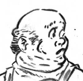
Right, first things first, scan your image as a greyscale or RGB image, you can scan an eight bit indexed colour image but you'll need to convert it to RGB or greyscale for the next step.
Clean it up as you feel fit, I use the Levels or Curves tool to adjust the blacks and whites. Once you've done that make sure your image is in RGB mode, if it isn't already. If you're working on a hight resolution image i.e. one intended for print there's a tip make life easier on machines with limited resources, see note 1 at the end.
You should have something like Fig. 1, a greyscale image on a single layer. You need to perform an extra step before you can proceed. You need to separate all non white coloured pixels from the white, not as tricky as it sounds. You accomplish this by creating a new channel then copy and paste the greyscale image into that channel.
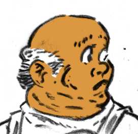
Now create a new layer on the image and use the channel to perform a selection .
Now perform a fill operation with black as your colour, you may have to invert the selection first, as black is normally the default mask colour for channels.
Now create another layer and move it beneath your outline, perform a select all and fill it with white.
Congratulations you've now separated your greyscale image into two portions, it's useful to name each layer as you go along, I suggest Outline and Base.
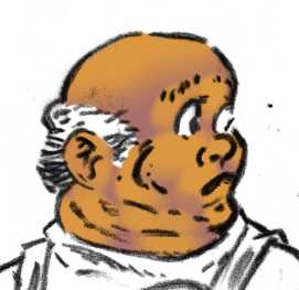
Now create a new layer beneath Outline and above Base and name it Flesh or Skin or whatever name takes your fancy. You can use the the brush tool to fill in your base flesh tone or perform a poly selection with the lasso or pen tools.and perform a fill. Choose a somewhat darker tone of flesh than that which represents the finished tone. This step is analogous to a coloured ink wash, over line work.
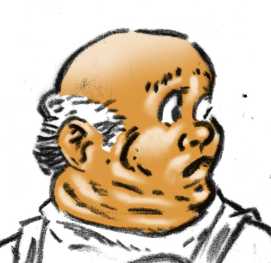
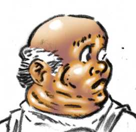
Fig. 3 shows the basic modelling, this would be analogous to using opaque body colour over an ink wash. To do this create a new layer above your basic tone then use the brush tool to paint in the modelling. It's best to ensure that the colouring on this layer remains within the area defined by your base flesh layer, I use a selection to ensure this but you could probably link the layers if you wish.
I generally perform this step using white and then set the opacity of this layer to some percentage.
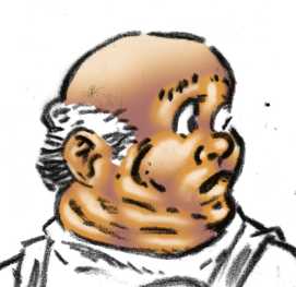
Now we want to perform the shaded part of our modelling and this where I normally cheat. Instead of faffing with a brush tool I perform some boolean logic to short cut the task. Since our shaded areas are the opposite of lighter areas we should be able to use the computer to do the task for us, and it turns out that, if we've done our job properly with lighter modelling, this is in fact the case. So...
In most cases, I like to perform this step with a solid colour, in this case a blue, then use the layer transparency to moderate it. If you're using it for a reverse high light, you'll need to keep the colour solid.
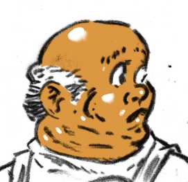
Highlights are optional, they're a different step from modelling because they represent reflected light at a coincident angle to the light source, therefore they're dependant upon your viewpoint. I generally only bother with them to indicate shiny surfaces. Keep them quite hard, on a separate layer, usually white on skin but moderated on shiny fabrics.
Figures 6 and 7 are included to clarify some of the steps described above.
The image in context, funnily enough I'm not happy with the face on this so it'll probably be changed pretty soon.
Note 1. Human visual acuity is concentrated in black and white, so you can get away with low resolution colour as long as the tonal range is in high resolution. If you need to create high resolution images in can be easier to colour them at low resolution and then rescale them and add a high resolution black overlay.
Right, first things first, scan your image as a greyscale or RGB image, you can scan an eight bit indexed colour image but you'll need to convert it to RGB or greyscale for the next step.
Clean it up as you feel fit, I use the Levels or Curves tool to adjust the blacks and whites. Once you've done that make sure your image is in RGB mode, if it isn't already. If you're working on a hight resolution image i.e. one intended for print there's a tip make life easier on machines with limited resources, see note 1 at the end.
 |
| Fig. 1 |
Now create a new layer on the image and use the channel to perform a selection .
Now perform a fill operation with black as your colour, you may have to invert the selection first, as black is normally the default mask colour for channels.
Now create another layer and move it beneath your outline, perform a select all and fill it with white.
Congratulations you've now separated your greyscale image into two portions, it's useful to name each layer as you go along, I suggest Outline and Base.
 |
| Fig. 2 |
 |
| Fig 3. |
I generally perform this step using white and then set the opacity of this layer to some percentage.
 |
| Fig 4. |
- First set the active layer to the one you painted in your lighter flesh tone on.
- Perform an alpha or transparency selection so that coloured area is the selected portion, in Gimp this is: Layer/Transparency/Alpha to Selection.
- Expand that selection, the amount you expand it depends on the resolution, some where between 5 and 12 pixels works for most screen resolution images, in Gimp this would be: Select/Grow for the appropriate dialogue.
- Now Feather your selection, this step is optional but you'll probably want to do it, the amount of feathering is resolution dependent, something less than half the amount you grew it is about right.
- Invert your selection.
- Set your base flesh layer to the active layer.
- Perform a selection intersect with the transparency on this layer, with your current selection, in Gimp this is: Layer/Transparency/Intersect with Selection
- Create a new layer, name it Flesh Shade.
- Perform a fill with your desired flesh shade colour.
In most cases, I like to perform this step with a solid colour, in this case a blue, then use the layer transparency to moderate it. If you're using it for a reverse high light, you'll need to keep the colour solid.
 |
| Fig. 5 |
 |
| Fig. 6 |
 |
| Fig. 7 |
 |
| Fig. 8 |
The image in context, funnily enough I'm not happy with the face on this so it'll probably be changed pretty soon.
Note 1. Human visual acuity is concentrated in black and white, so you can get away with low resolution colour as long as the tonal range is in high resolution. If you need to create high resolution images in can be easier to colour them at low resolution and then rescale them and add a high resolution black overlay.
Friday, 9 August 2013

Wednesday, 7 August 2013
Three pics.
Knocked this out a couple of hours ago, it took me ages to do the finished artwork and then I smudged the ink, what an idiot. Just goes to show how rusty I am, the inkwork was so bad I thought I'd better colour it, it was orginally supposed to be just black and white. The colour's not fantastic either, I'm using a mouse and it's a bit like drawing with your feet, I did the second panel first and by the time I got to the sea in the first one, I really rushed the highlights as you can see. I might tart it up a bit tomorrow.
 |
| Pencil sketch |
 |
| A very poor ink job |
 |
| The colour |
Subscribe to:
Posts (Atom)